Rido
Rido is a unified interface designed for multi-app delivery riders that aggregates earnings, traffic, and battery data into a single Command Center. By bridging the gap between digital offers and physical hardware limits, Rido eliminates cognitive overload, enabling riders to make safer, profitable decisions
Project Type
Concept
Role
UX/UI Design
Year
2026

Context
Overview
In the high-stakes environment of the gig economy, delivery riders are currently fighting an 'Information War.' To survive, they must act as human data processors juggling offers from Uber and Wolt, monitoring traffic, and checking e-bike battery levels all within a 15-second acceptance window while riding in traffic.
My goal is to solve this fragmentation by creating a centralized layer that sits above the competing apps. I aim to transform the rider's workflow by visualizing 'Net Value' instead of just gross pay, integrating real-time hardware telemetry to prevent 'Range Anxiety,' and digitizing community wisdom to warn against unsafe locations. Ultimately, I want to shift the user experience from chaotic multitasking to strategic business management.
Background
When I moved from India to Germany, I noticed a surprising pattern on the streets. Whether in Bangalore or Berlin, delivery riders often wore jackets from one company while delivering for another. But the most confusing part was their bike setup. I saw that almost 2 out of 10 riders had more than one phones mounted to their handlebars at once. It looked chaotic and stressful, yet it was happening in two completely different parts of the world.
This didn't make sense to me. Why would a simple food delivery job require such a complex setup? Using multiple devices seemed expensive and difficult to manage while riding a bike in traffic. I realized that if users in different countries were doing the exact same strange behavior, there must be a deeper reason behind it. I decided to dig deeper to understand why this was so necessary for them.
Investigation
To understand what was going on, I spoke to few riders. They explained that since they are independent contractors and not employees, they aren't loyal to just one company, they are loyal to whoever pays the best at that moment. The multiple phone was their way of managing this freedom. They used one phone specifically to stay online on multiple apps simultaneously to catch the highest paying orders. The second phone was used as a dedicated to check maps for traffic, calculate real distances, and verify locations before accepting a job. They were manually piecing together information that the apps didn't provide in one view.
The Realization
I realized that the multiple phone wasn't a solution, it was a failure. The riders are essentially in an Information War.
When a notification pops up, they only have 15 to 30 seconds to accept the order. In those few seconds, they have to manually piece together a puzzle like checking the price on Phone A, checking the traffic on Phone B, and estimating if their battery will last if an e-bike. They are fighting against a ticking clock to process complex data that is scattered across different screens. This isn't just a logistics problem, it is a Cognitive Overload problem.
The Problem Statement
How can we help riders visualize the correct combination of data, price, distance, and effort in a single view, so they can stop performing complex calculations in their heads and make a confident, informed decision instantly?
The Challenge
There were two major hurdles that made this problem unique. First was that platforms like Uber and Zomato don't share their data, in fact, they act as walled gardens to keep control over the worker. This meant I couldn't just ask for the data, I had to find a way to interpret it. Second was the environmental challenge, unlike a standard app used in a quiet room, this tool had to function on a under bright sunlight or rain, and while the user was moving at 30km/h in traffic. I realized that if the interface required more than one tap or 3 seconds of focus, it would fail in the real world.
Research
I started by analyzing the current tools available to riders are only the apps themselves (Uber, DoorDash, Zomato). I realized that while these apps are excellent at logistics (getting from A to B), they fail at information management or we can say information hierarchy . They function as walled gardens, meaning they don't share data with each other. Uber doesn't know your DoorDash earnings, and Google Maps doesn't know your E-bike battery level. This confirmed that no existing tool was solving the information war, creating a clear opportunity for a Third-Party Interoperability Layer that sits above the competition rather than trying to replace them.
Design Process
The Target Audience
I defined my core audience not as casual riders, but the gig workers who juggle multiple platforms (like Uber and Zomato) simultaneously to maximize their profit. These users face the highest cognitive load, as they must constantly balance financial goals against hardware constraints in real-time to survive.
Field Research
To move beyond my own assumptions, I went directly to the source. I spent time at busy restaurant pickup zones and rider hubs, approaching gig workers during their downtime to ask about their actual daily reality. I didn't just ask "which app is better?", I asked about their frustrations, their fears, and what they felt was missing from their tools. They opened up about the invisible stress of the job and the anxiety of unpaid wait times, the fear of accepting a bad orders that loses them money, and the mental fatigue of constantly calculating risks. These raw conversations confirmed that they didn't need another delivery app, they needed a support system.
User Persona
Among the riders I spoke with, one interaction stood out and became the foundation for my primary persona.
I met Mr Melone , a Master's student who has been delivering for 8 months to support his studies. He was kind enough to walk me through his entire shift, showing me exactly how he hacks the system to survive.
Me: "Why do you have two phones mounted on your bike? Is one broken?"
Mr Melone: "No, this one is for the apps (Uber/Wolt), and this one is for Maps. If I switch apps on one phone, the GPS sometimes freezes or I miss a pop-up offer. I can't afford to miss a €10 order just because I was checking the traffic. I need to see everything at once."
Me: "What is the hardest part of the shift? The traffic? The weather?"
Mr Melone: "It's the stress of the 'bad order.' Sometimes I accept a €5 trip, but the restaurant makes me wait 20 minutes. I don't get paid for waiting. So I spent 40 minutes for €5. That’s less than minimum wage. I need to know if a restaurant is slow before I say yes."
Ideation
I started with low-fidelity paper sketches to figure out the basic structure. I knew i need to first solve the information hierarchy problem need to structure all the information in way it is easy to see and process.


Then I went to Figma to build some low-fidelity designs to see how the paper sketch ideas look in the digital landscape.


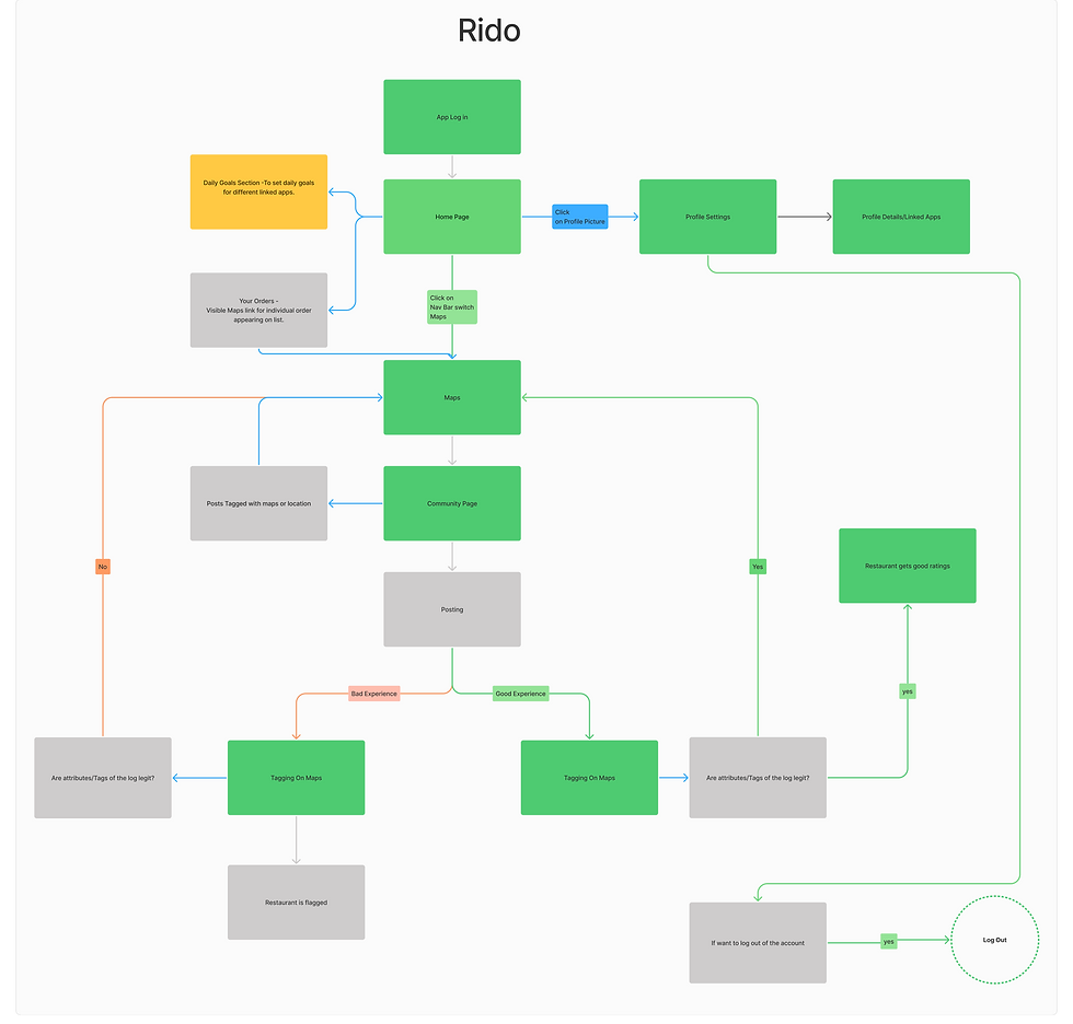
Information Architecture
Then I wanted to create a user flow based on the low fidelity screens created.
High Fidelity Screens
Before creating the high-fidelity screens i wanted to create the visual language for the application.


Feedback
After finalizing the high-fidelity prototype, I took the design back to the riders. The goal was to test if the Command Center concept actually reduced their stress.
-
Clarity: "Finally, I don't have to calculate the distance in my head. The '15€' card is exactly what I look for."
-
Safety: "The grey-out map feature is smart. I've been stuck twice this month because I thought I could make a trip."
-
Community: "If I could actually warn others about the wait times at , I would use this every day."
But one feedback I got is that on the main home screen, they found it a little difficult to identify the different orders arriving from different apps on the go.
So one solution came to mind why not use the respective app colors to differentiate specific metrics.

Outcome
The Impact
-
Cognitive Load: Reduced decision time from ~15 seconds to <5 seconds by pre-calculating value.
-
Financial Health: projected 15-20% increase in weekly earnings by eliminating "dead miles" and bad orders.
-
Safety: Zero "Range Anxiety" incidents due to hardware-aware navigation.
Key Takeaway
I learned that extreme constraints like a 15-second decision window and harsh outdoor conditions are actually catalysts for clarity. This project redefined empathy for me, as it wasn't just about understanding the user's struggle, but about visualizing the specific data that actively protects their livelihood. Ultimately, Rido demonstrated that design doesn't always need to reinvent the platform but sometimes, the most powerful innovation is simply building a better bridge between existing systems, transforming the rider from a passive gig worker into an active, strategic business manager.